


%20Data%20in%20GA4.webp)


In our previous posts, we covered essential steps such as properly setting up Google Analytics 4 (GA4), refining Google Tag Manager (GTM) implementations, and identifying errors when testing GA4 and GTM. While accurate data collection is crucial, raw numbers alone are not enough to drive meaningful insights. GA4’s built-in reports can sometimes feel overwhelming, and its default charts may not always provide the clarity needed for effective decision-making. That’s why visualizing your data in a clear, customized, and interactive way is essential.
To get the most out of GA4, we recommend using Google Looker Studio—a free, intuitive tool that allows you to build tailored reports and interactive dashboards. Unlike GA4’s native UI, Looker Studio lets you transform raw data into compelling visualizations that highlight key trends and performance insights. In this post, we’ll walk you through the process of setting up Looker Studio reports, helping you turn complex data into actionable insights that drive smarter business decisions. Let’s dive in!
What is Looker Studio?
A Looker Studio report is a customizable, interactive dashboard that visualizes data from various sources, such as Google Analytics 4 (GA4), Google Ads, and BigQuery. It allows users to create dynamic charts, graphs, and tables, making complex data easier to understand. With features like real-time updates, automated reporting, and sharing options, Looker Studio helps businesses track performance, identify trends, and make data-driven decisions efficiently.
How to Connect Google Analytics 4 with Looker Studio
Follow these steps to connect your Google Analytics 4 (GA4) property with Looker Studio and start building interactive reports:
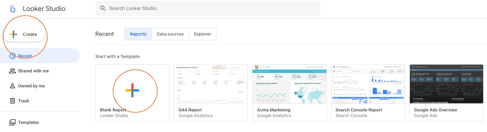
Step 1: Open Looker Studio
1. Go to Looker Studio and sign in with your Google account.
2. Click the “+ Create” button in the top-left corner and select “Report” to start a new report.
Step 2: Add a Data Source
1. In the Add Data to Report panel, click “Google Analytics” under Google Connectors.
2. If prompted, authorize Looker Studio to access your Google Analytics account.

Step 3: Select Your GA4 Property
From the list of available accounts, select the Google Analytics 4 property you want to connect.
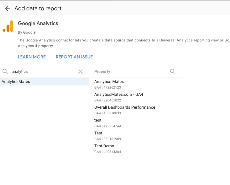
2. Click “Add” in the bottom-right corner, then select “Add to Report” when prompted.
Step 4: Build Your Report
1. Looker Studio will now display a blank report with your GA4 data connected.
2. Use the Chart options to add visualizations like tables, bar charts, and scorecards to display key metrics.
3. Customize your report by adjusting date ranges, filters, and formatting options.
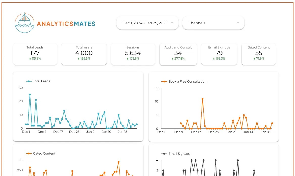
You can start downloading the Analytics Mates dashboard and play around it. You can watch our short video here on how to connect the dashboard to your own data source.
And that's it! You now have a reporting dashboard that serves as your go-to tool for monitoring your site's performance over any specific time frame. Pretty awesome, right? But wait, there's even more to explore...
5 Fundamental Features and Techniques in Google Looker Studio
Here are 5 more things you need to apply into your Looker Studio report to make it even comprehensive.
- Blending data
- Filters (Include and Exclude)
- Calculated Fields
- Formatting Techniques
- Funnel reports
Blending data
Blending data in Google Looker Studio refers to the process of combining data from multiple sources into a single report or visualization. This allows you to create a unified view of your data, even if it’s coming from different platforms or datasets, such as your own Google Analytics 4, Google Ads, or a third-party service like Salesforce.
Why Blend Data?
Blending data is helpful when you need to:
- Compare data from different platforms in one report (e.g., traffic from Google Analytics and ad spend from Google Ads).
- Combine metrics and dimensions that aren’t available in a single data source.
- Build more comprehensive reports that provide a holistic view of your business performance.
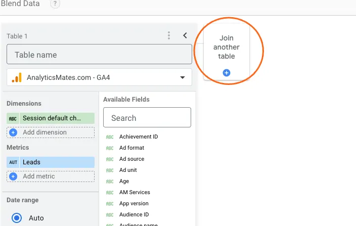
How to Blend Data in Looker Studio:
1. Create a New Report: Open Looker Studio and create a new report or open an existing one.
2. Add Data Sources:
- Click on the “Resource” tab and select “Manage Added Data Sources”.
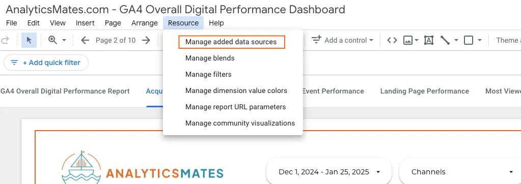
- Add the data sources you wish to blend, such as GA4, Google Ads, or a custom database.
3. Use the “Blend Data” Feature:
- After adding your data sources, click on “Add a Chart” (e.g., a table, scorecard, or bar chart) or click on the data that you want to modify and blend with other data sources.
- In the Data section, click on “Blend Data” (found next to the data source drop-down menu).
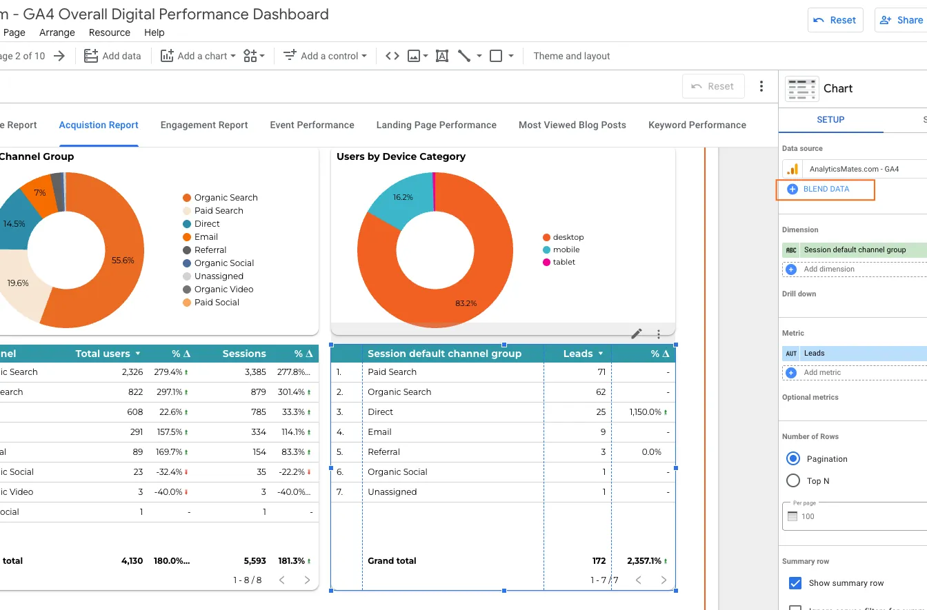
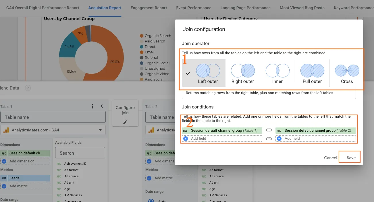
- Looker Studio will prompt you to select which data sources you want to blend and which fields should be used as keys to match data across the sources.
4. Select Matching Fields: Choose the fields that will be used to match data between the sources (e.g., Date, Campaign Name, or Product ID). This is how Looker Studio knows how to combine the data correctly.For more information about join configuration or operator you can check it here.
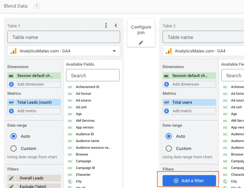
5. Choose Metrics and Dimensions: Select the metrics (e.g., clicks, sessions, revenue) and dimensions (e.g., campaign, device, location) you want to display in your chart or report.
6. Final Adjustments: Once blended, you can adjust filters, sort orders, and customize the visualizations based on your needs. Please note that the filter should be applied here, rather than directly to the data (scorecards, graphs, or charts), if you need to filter the results.
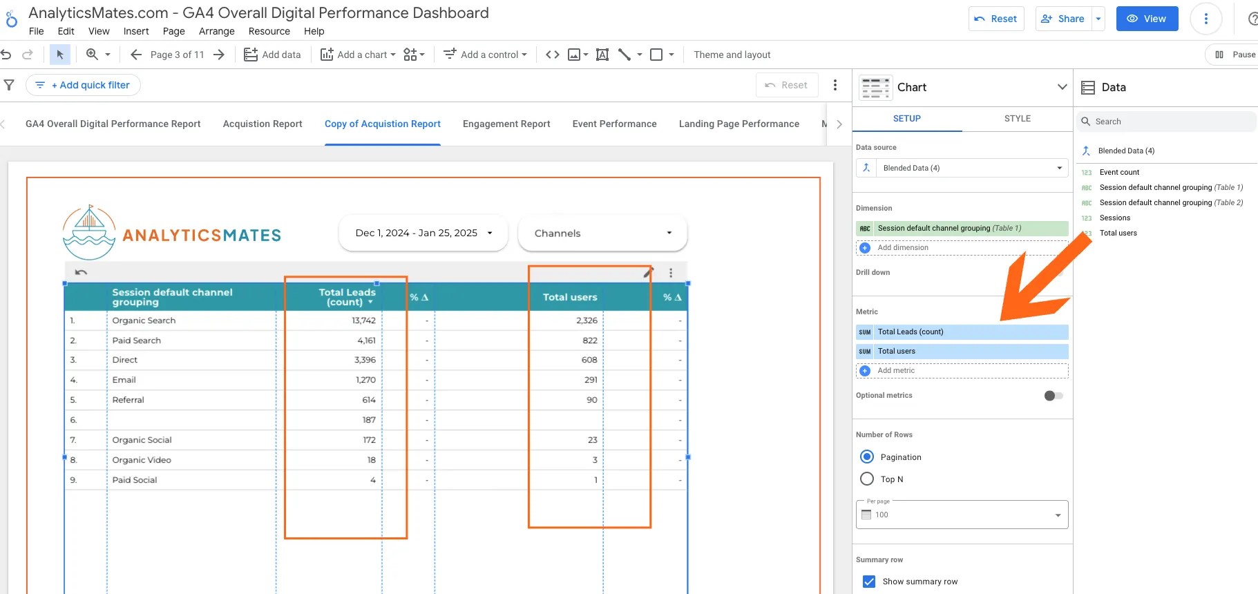
10. You can now combine data into your reports seamlessly. For example, event count and total users cannot be analyzed together without blending the data sources. This is because event count needs to be filtered by a specific event name (e.g., "event name equals 'leads'"). If you apply a filter to a table with blended data, it will filter both metrics, potentially leading to a report that lacks clarity or makes no sense.
Filters in Google Looker Studio: Include and Exclude Filters
In Google Looker Studio, filters are essential tools that allow you to refine your data and control what information appears in your reports. Filters help you include or exclude specific data based on conditions you set, ensuring that your reports focus on the most relevant insights. There are two main types of filters you'll work with in Looker Studio: Include Filters and Exclude Filters.
Include Filters
An Include Filter allows you to only show data that meets specific criteria. In other words, it helps you narrow down your dataset to only the relevant records that meet the conditions you set. For example, if you want to see data only for a specific campaign or region, you would apply an Include filter.
How to Apply an Include Filter:
1. In your Looker Studio report, select the chart or data source where you want to apply the filter.
2. In the Data panel, scroll down to Filter and click Add a Filter.
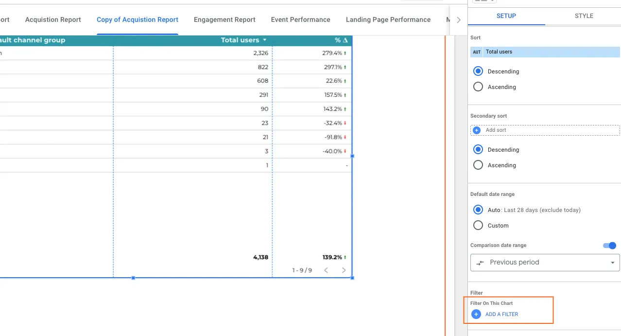
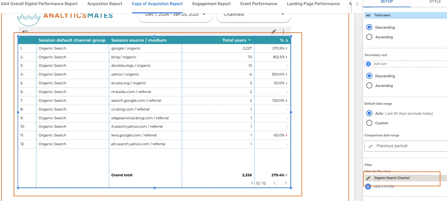
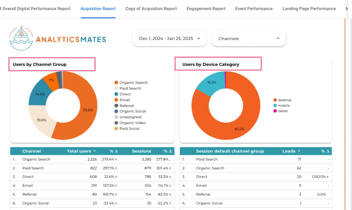
3. In the filter settings, choose the condition (e.g., "Product Category") and set the filter to Include with the value you want to show (e.g., "Electronics"). In this example, we will only show data from Organic Search channel traffic.

4. Click Save to see the filtered data.
Exclude Filters
An Exclude Filter works the opposite way: it allows you to remove certain data from your report based on the conditions you set. Use an Exclude filter when you want to filter out specific data that you don’t want to include in your analysis.
How to Apply an Exclude Filter:
1. In your Looker Studio report, select the chart or data source where you want to apply the filter.
2. In the Data panel, scroll down to Filter and click Add a Filter.
3. In the filter settings, choose the condition (e.g., "IP Address") and set the filter to Exclude with the value you want to remove (e.g., your team's internal IP addresses). In this example we will remove the “Unassigned” channel from the chart.
![oogle Data Studio report titled "GA4 - Overall Digital Performance Dashboard." The report shows a table with data on "Session default channel group," "Session source / medium," and "Total users" for various channels. The table is sorted by "Total users" in descending order. The highlighted row shows "Referral" traffic coming from "chatgpt.com/referral [invalid URL removed]" with 15 total users and a 1400.0% increase.](https://cdn.prod.website-files.com/62dec02b8093ac60c15793a2/679b6ba16028ab804467f961_679b687d8fb3bce142d7c1fa_img_14.webp)
Here’s the settings:
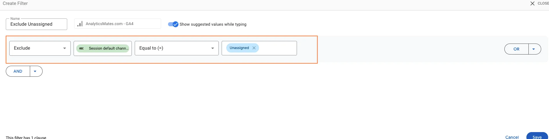
4. Click Save to exclude that data from the report. The Unassigned channel is no longer showing in your report.
When to Use Include vs. Exclude Filters:
- Use Include Filters when you want to focus on specific subsets of data (e.g., viewing performance for a particular product, campaign, or region).
- Use Exclude Filters when you want to remove certain data that may distort your analysis (e.g., removing test data or internal traffic).
Using filters effectively in Google Looker Studio helps you create more accurate and meaningful reports by ensuring that you only work with the data that is most relevant to your analysis.
Calculated Fields in Google Looker Studio
Calculated Fields are powerful tools that allow you to create custom metrics and dimensions directly within your reports. These fields enable you to perform mathematical, logical, and text-based operations on your data, helping you customize and manipulate your data in ways that are not available by default in your data sources.
Why Use Calculated Fields?
Calculated fields provide a way to:
- Create custom metrics that combine or modify existing data (e.g., calculating the cost per acquisition from ad spend and conversions).
- Perform data transformations directly in Looker Studio, without needing to adjust the source data itself.
- Make your reports more dynamic by adding insights that are tailored to your specific needs.
Types of Calculated Fields
- Basic Arithmetic: You can create new metrics by performing arithmetic operations (addition, subtraction, multiplication, and division) on existing fields. For example, you can calculate the Average Order Value (AOV) by dividing total revenue by the number of orders.
Example:
Revenue / Transactions = Average Order Value - String Manipulation: Calculated fields can also perform operations on text, such as concatenating fields or extracting specific parts of a string.
Example:
CONCAT('Product: ', Product Name) = Product Name with a Prefix - Conditional Logic: You can apply conditional statements like IF to generate new fields based on certain criteria. This allows you to create segments or groups based on conditions.
Example:
IF(Revenue > 100, 'High Value', 'Low Value') = Classifying revenue as high or low value - Date Functions: Date functions allow you to manipulate or format date values, which can be useful for creating custom time-based segments, such as year-over-year comparisons or monthly averages.
Example:
YEAR(Date) = Extracts the year from a date - Aggregation Functions: Calculated fields can also use aggregation functions like SUM, AVG, COUNT, or MAX to calculate values at a higher level, such as total sales or average session duration.
Example:
SUM(Revenue) = Total Revenue
How to Create a Calculated Field in Looker Studio
1. Open Your Report: Start by opening an existing report or creating a new one in Looker Studio.
2. Add a Data Source: Ensure that the data source you want to use is already added to your report. If not, you can add a new data source.
3. Create a Calculated Field:
- Click the data you want to apply to the calculated field. In this example we will include a user conversion rate (formula: User Conversion rate = total leads / total users). for In the Data panel, click on Add a Field.
![Google Data Studio report titled "GA4 - Overall Digital Performance Dashboard." The report shows a table with data on "Session default channel group," "Session source / medium," and "Total users" for various channels. The table is sorted by "Total users" in descending order. The highlighted row shows "Referral" traffic coming from "chatgpt.com/referral [invalid URL removed] [invalid URL removed]" with 15 total users and a 1400.0% increase.](https://cdn.prod.website-files.com/62dec02b8093ac60c15793a2/679b6ba26028ab804467f9f1_679b68f58fce24fbed92ebb0_img_17.webp)
- This will open the Calculated Field Editor, where you can define your custom metric or dimension. Input the formula into the calculated field panel (formula: User Conversion rate = total leads / total users).
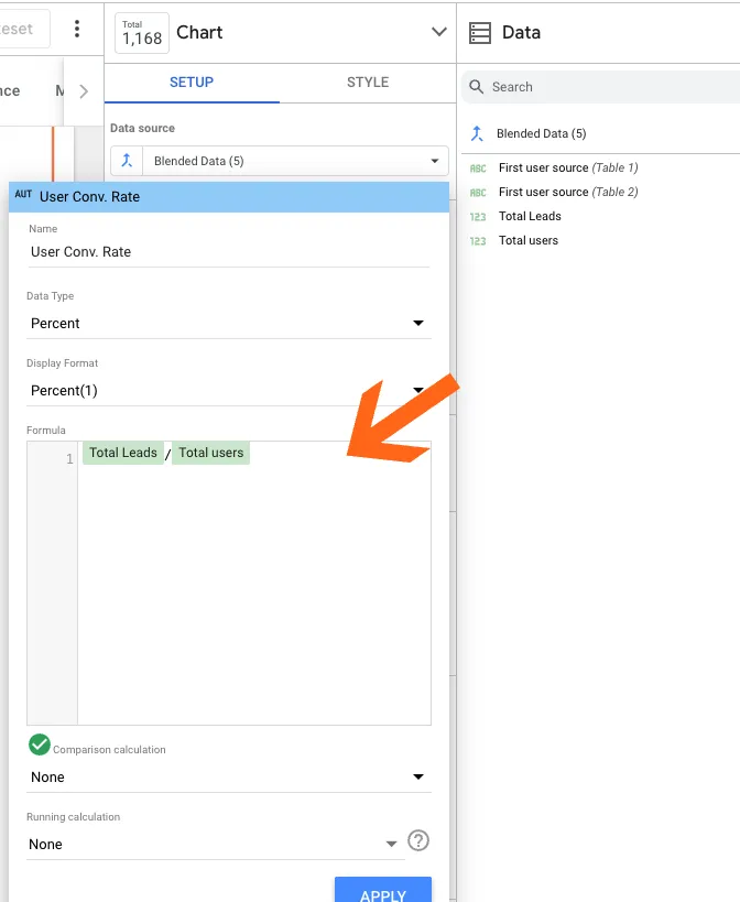
- Name your calculated field and enter the formula based on your desired calculation.
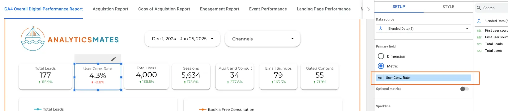
4. Apply and Use: After creating the calculated field, it will appear in your list of available fields. You can now add it to your charts, tables, or other visualizations, just like any other field.
Example Calculated Fields:
- Conversion Rate:
Formula: Conversions / Sessions
This field calculates the conversion rate by dividing the number of conversions by the total number of sessions. - Cost per Click (CPC):
Formula: Ad Spend / Clicks
This calculates the average cost for each click based on your total ad spend and number of clicks. - Profit Margin:
Formula: (Revenue - Cost) / Revenue
This formula shows the profit margin percentage for each transaction or sale.
Limitations:
- Performance: Complex calculated fields with large datasets may impact performance.
- Complexity: For advanced calculations or operations, users may need to have some understanding of functions, logic, and syntax.
Overall, calculated fields in Google Looker Studio empower you to create more relevant and insightful reports that meet your specific business and analytical needs.
Formatting Techniques in Google Looker Studio
In Google Looker Studio, formatting is an essential aspect of creating clear, visually appealing reports that convey insights effectively. By leveraging various formatting techniques, you can enhance the presentation of your data, make key metrics stand out, and ensure that your audience can quickly interpret your visualizations.
Here are some common formatting techniques in Looker Studio that can help elevate your reports:
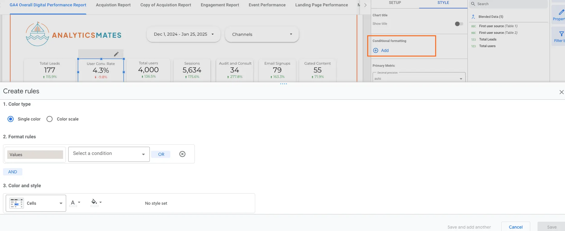
1. Conditional Formatting
Conditional formatting allows you to apply different styles to your data based on its value. This is helpful in highlighting trends, outliers, or specific thresholds, such as showing red for negative values or green for positive ones.
- How to use: You can apply conditional formatting to tables, scorecards, or charts. For example, you might choose to format values based on a range (e.g., 0–50 is red, 51–100 is yellow, and 101+ is green).
- When to use: This is useful for performance tracking or when comparing metrics like revenue, conversion rates, or customer satisfaction scores.
2. Font and Text Customization
Adjusting the font size, style, and color of text can make your reports easier to read and more engaging.
- Font Size: Increase the font size for headers, titles, or key data points to make them stand out. Smaller text can be used for secondary data.
- Font Color: Use contrasting font colors to differentiate between headings and data values. Stick to a color palette that aligns with your brand or the theme of your report.
- Font Style: You can use bold or italic text to highlight key data or important metrics.
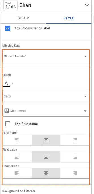
3. Data Label Formatting
For charts, graphs, and tables, formatting the data labels helps your audience interpret the data more easily.
- Positioning: Adjust the position of data labels (e.g., inside, outside, top, bottom) to ensure they are readable without cluttering the chart.
- Number Formatting: You can format numbers with or without decimals, use currency symbols, or add percentage signs to make the data more intuitive (e.g., $1,000 instead of 1000).
- Thousands Separator: Use a comma (or space, depending on the locale) as a thousands separator to make large numbers more readable.
4. Color Customization
Choosing appropriate colors for your charts and graphs helps your audience interpret the data better and quickly identify trends.
- Customizing Colors for Charts: You can change the color of individual bars, lines, or pie slices based on different categories or metrics.
- Color Palette: It's important to use a consistent color palette throughout your report. This creates a cohesive design and helps viewers easily distinguish between different data points.
- Highlighting Key Data: Use brighter or contrasting colors to draw attention to critical metrics, such as KPIs or areas of concern.
5. Alignment and Spacing
Proper alignment and spacing contribute to the visual appeal and readability of your reports.
- Alignment: Ensure that your text and visual elements are properly aligned (e.g., left, center, right, or justified) so that the report looks organized and balanced.
- Padding and Margin: Add space around text boxes, charts, and tables to avoid a cluttered look. This helps in making the report easier to navigate and more visually appealing.
6. Using Grids and Borders
Grids and borders help organize data and give structure to your reports, making it easier for your audience to follow.
- Gridlines: For tables and charts, you can enable gridlines to help separate rows and columns, making the data more digestible.
- Borders: You can apply borders around data tables, scorecards, or graphs to emphasize key sections of the report or make them stand out from the background.
7. Adding Icons and Images
Icons and images can help break up text-heavy reports and provide a visual representation of the data or concepts you're discussing.
- Icons: Use icons to represent specific metrics or actions, such as a shopping cart icon for e-commerce data or a checkmark for successful conversions.
- Images: Adding relevant images (such as company logos or product photos) can help personalize your report and align it with your brand.

8. Responsive Layouts
With Google Looker Studio, you can create reports that adapt to different screen sizes, ensuring that your reports are viewable on both desktop and mobile devices.
- Adjusting Layout for Devices: Set up different layouts for desktop and mobile views to ensure your reports look good and are easy to navigate on any device.
- Dynamic Content: You can use interactive features like filters and drop-down menus that adapt as the viewer interacts with the report, ensuring that key information remains accessible.
9. Interactive Features
Interactive elements make reports more dynamic and engaging. These features allow users to explore data in a more hands-on manner, providing them with deeper insights.
- Filters: You can apply filters for users to drill down into specific data segments (e.g., by date range, location, or device type).
- Date Range Control: Adding a date range control lets users adjust the time period they’re viewing, which is especially useful for tracking trends over time.
- Data Source Controls: Allow users to choose between different data sources to explore various segments of your data.
10. Layout and Design Tips
The design of your report plays a huge role in how easy it is to digest the information presented.
- Consistent Layout: Keep the layout consistent throughout your report, using similar formatting for each section to create a smooth flow for the reader.
- Use of White Space: Don't overcrowd your report with too many visuals or text. White space makes it easier to focus on the key data points and improves overall readability.
- Balance Between Text and Visuals: Use a mix of charts, graphs, and text to create a balanced report. Avoid long paragraphs of text and instead use bullet points or short descriptions to highlight key insights.
By mastering these formatting techniques in Google Looker Studio, you can create reports that are not only visually appealing but also more effective in delivering insights. Well-formatted reports help ensure that your audience quickly grasps key points and is able to make informed decisions based on the data presented.
Funnel Reports in Google Looker Studio
Funnel Reports visualize the stages of a user journey, helping to identify where users drop off in a process, such as a purchase or sign-up flow. A funnel typically tracks a series of steps — for example, "Visit Website" → "Add to Cart" → "Checkout" → "Purchase." By creating a funnel report, you can measure conversion rates at each stage and pinpoint where improvements are needed.
In Looker Studio, funnel reports help monitor key business objectives like increasing e-commerce sales, improving lead conversions, or optimizing user engagement. You can build funnels using different metrics and dimensions (e.g., page views, events, transactions) and filter by date ranges, devices, or user types to analyze performance in detail. This powerful tool helps businesses refine their strategies by understanding user behavior and minimizing drop-offs at critical points in the conversion process.
You can check out our blog post to dive into how to create funnel reporting in Google Looker Studio here.
And Wait, There’s More…
At Analytics Mates, we believe in the power of data-driven decision-making, and we want to help you unlock even more insights in Google Looker Studio. While your reporting dashboard is already a great starting point, there’s always room for growth. That’s why we’re excited to share with you 3 Must-Have Custom Reports that will take your reporting game to the next level.
These reports are designed to provide deeper insights into your website’s performance, helping you track user behavior, conversions, and engagement more effectively. By incorporating these custom reports into your Looker Studio dashboard, you’ll be able to make smarter, more informed decisions that drive your business forward.
Final Words
There are many features you can apply to your reporting in Google Looker Studio, and it’s easy to feel overwhelmed at first — especially if some data doesn’t appear as expected. While the tool continues to evolve, its power in reporting is undeniable. While it may not offer all the features of paid tools, for a free platform, we can confidently say that Looker Studio has been instrumental in shaping both our own and our clients' reporting journeys.
Thank you for reading!
We're always looking for ways to improve our Google Analytics 4 blog content. Please share your feedback so we can make it even better.


